
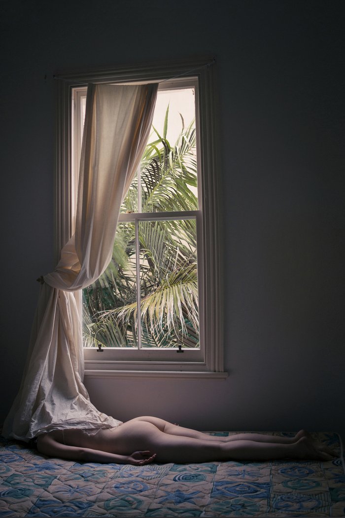
“Closure” - Digital C-print, 2016
So Brooke, tell us about yourself and how you got into photography?
I'm 26 years old, born and raised in Ohio, now living in NYC. I studied photojournalism in school and while I was interning for a newspaper in Kentucky, I started making self-portraits as a side project to work through some personal stuff that was happening the time. Basically, if I wasn't eating tuna melts and watching Lost, I was practicing photography. That was a dope summer.

"Counterparts III” - Archival inkjet print, 2016
Your work features a range of subject matter but often a similar pastel colour palette, what do you think attracts you to this colour palette and how does its use help you in your practise explorations?
It's inspired by the house I grew up in, which had undertones of 1950s post-war suburbia and the perception of utopian America that existed at the time. When you leave a place you spent your whole life, you start to notice small details each time you return--sort of like a rediscovery of that location. There is a contrast between the lightness of my color palette and the [sometimes] darkness of my subject matter that's reflective of the juxtaposition between ideals and reality. Returning home can be a very alienating experience, and that's been a great source of inspiration to me lately.

"The Staircase” - Digital C-print, 2016
The portrait photography you’ve shot is categorised into ‘light’ and ‘dark’, why is it important to you that the two are seen as different series of work?
It was an aesthetic decision. Most of my work is relatively high-key, but since I got a studio space a year ago I've been experimenting more with darker tones. Perhaps at some point I'll work them into one grouping but for now, my neurosis requires I keep them separate.
"Quiet Places II” - Archival inkjet print, 2016
Your still life series ‘In Bloom’ is wonderful, but for those readers less familiar with more avant garde photography tell us about what your trying to say with the shoots and why you wanted to say it.
I started making still life photos as a way of branching out from photographing exclusively people. It was really challenging for me to convey concepts without using human attributes, so that's what I was trying to do. Flowers are such a ubiquitous prop, but I found that if I created unusual environments for them to occupy, their meaning changed each time. So the series is an attempt to create uncanniness in the everyday, and explore how context changes our connotations of these objects.

"Summer in January” - Archival inkjet print, 2016
The floral motif seen in ‘In Bloom’ is also carried over into other aspects of your photography like your series ‘roses’ which features melting wax flora - flowers must hold a significance for you, is there something you're representing or alluding to with your use of them in your work?
The use of flowers in art is far from innovative, but it's their ambiguity I'm drawn to. They can signify a time of mourning in one context, or a time of love and celebration in another.

"Nature's Call” - Digital C-print, 2015
Your list of publications that your work has been featured in is quite extensive, tell us more about having your work featured to be seen by the masses and which photo were you most excited to have featured and where did it feature?
Its been great in many ways--helped me build an audience to engage with my work and also has led to several commissions along the way. The downside of this is for every image I've profited off of, I've probably had a dozen images stolen and misappropriated without my consent, especially on Instagram lately. There are several art accounts with large followings that pride themselves on being content curators, yet fail to give credit to the artists they feature. "Unknown Artist" is lazy, and it does nothing to benefit the producer or the art community as a whole. Besides, you can google an image and find the creator almost instantly these days.
The most exciting feature I've had recently was on Vogue.it. Gregory Crewdson and Alessia Glaviano curated a selection of images based on the theme of uncanniness, and one of my photos was selected. I've been a huge admirer of Crewdson's work since I first started out in photography, so that was really awesome.

"Next-door” - Digital C-print, 2014
TO SEE MORE OF BROOKES WORK VISIT www.brookedidonato.com
INTERVIEW by HANNAH SMITH ( Art Jobs )
